Home / Website Design and Build / JJS Electrical Solutions
Case study
One brand, from the board outside to the review on Google
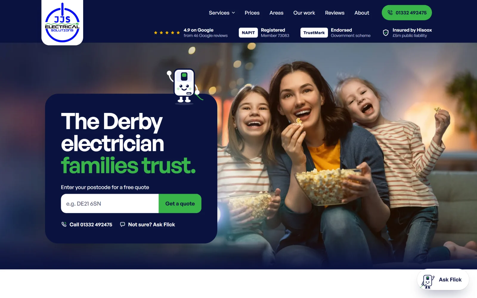
JJS Electrical Solutions is a NAPIT-registered team in Chaddesden, Derby. We designed their first print, then built their website, and their brand came out of it. Their next print run is designed in that brand, so every piece will look like the same company.
- Client
- JJS Electrical Solutions Ltd
- Where
- Chaddesden, Derby
- What we did
- Website design and build, brand, print design
- Website
- jjselectricalsolutions.co.uk
The business
Josh started on the tools at sixteen
He did his apprenticeship, set up on his own after the pandemic, and grew that into JJS Electrical Solutions, a team covering Derby and Derbyshire. Rewires, fuse boxes, EV chargers, fault finding and safety checks, for homes, landlords and businesses.
The website
Four decisions that do the selling
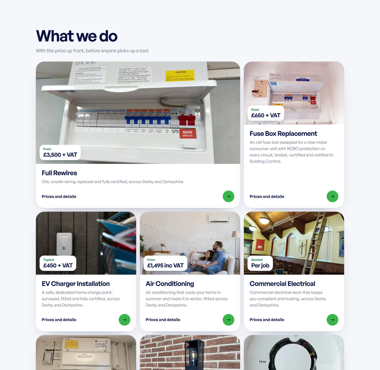
Prices on the page
Most trades sites hide their prices. Every JJS service shows one: a full rewire from £3,500 plus VAT, a fuse box from £650 plus VAT. People who call already know roughly what to expect.
Trust before the scroll
The Google rating, NAPIT membership, TrustMark and the insurance sit in the header of every page, so they are seen before anything else.
A quote in two minutes
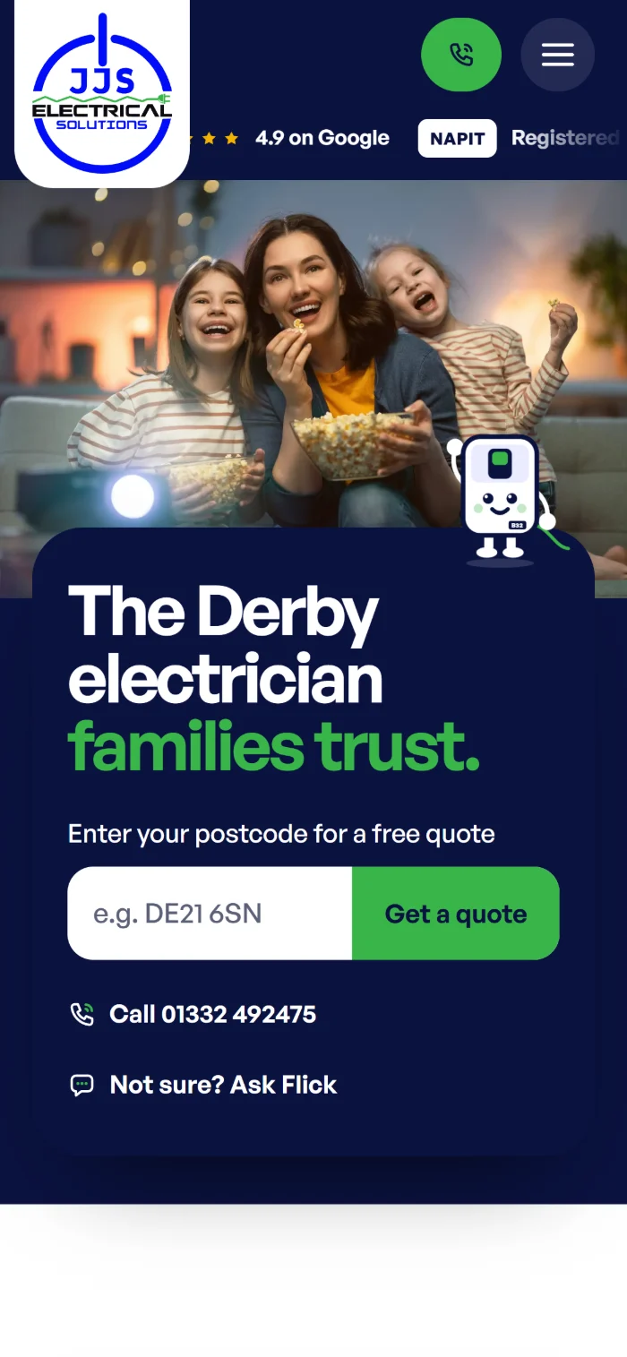
The first screen asks for one thing: a postcode. From there the quote tool walks through the job, and anyone unsure can ask Flick.
A character people remember
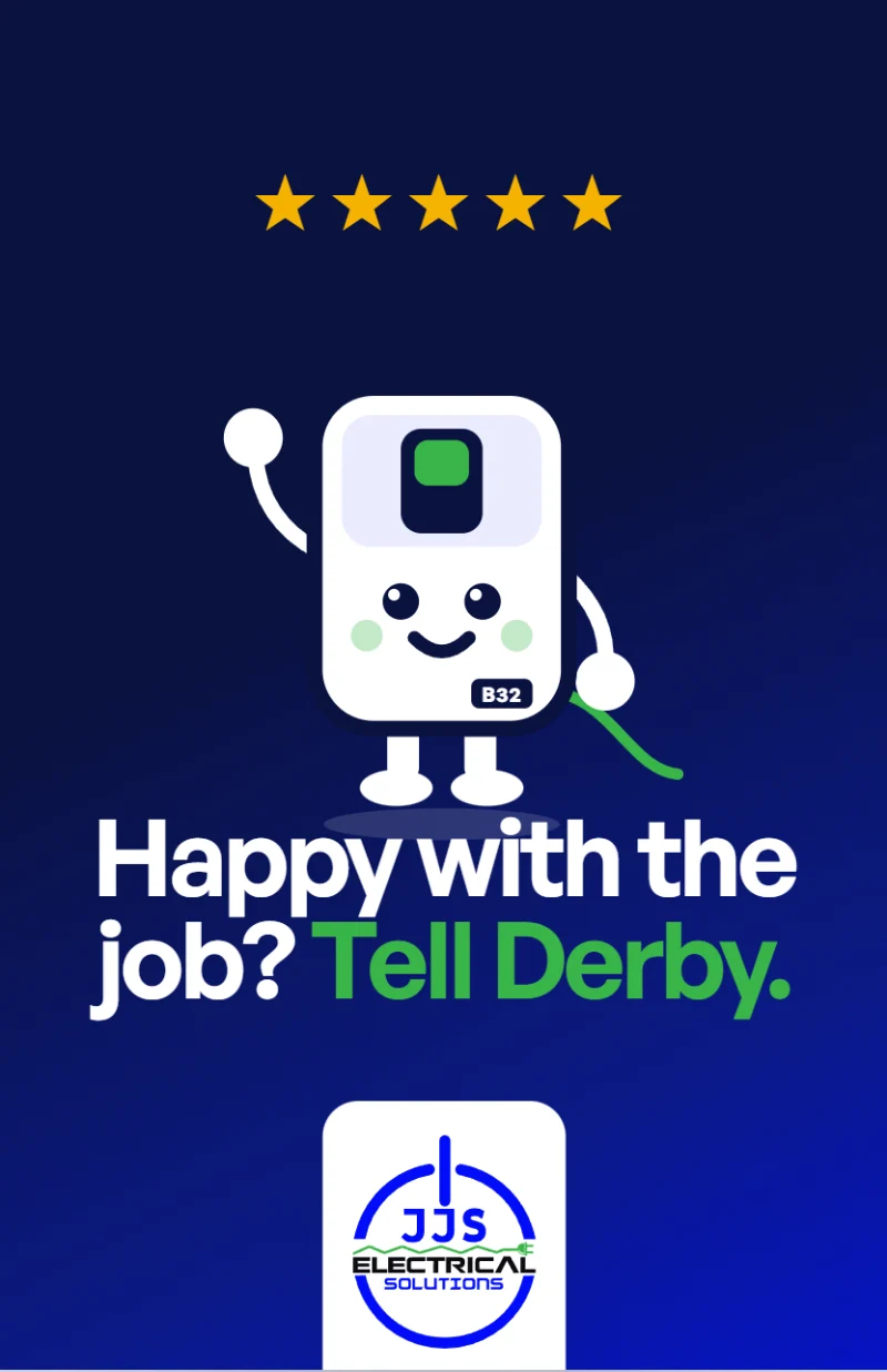
Flick, the consumer unit with a face, guides people through the site. Next to a field of blue electrician logos, Flick is what makes JJS recognisable.
The print
The print, redesigned from the brand
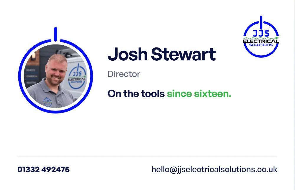
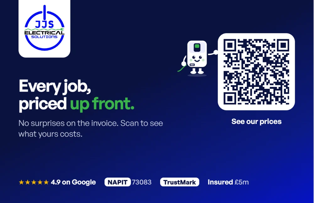
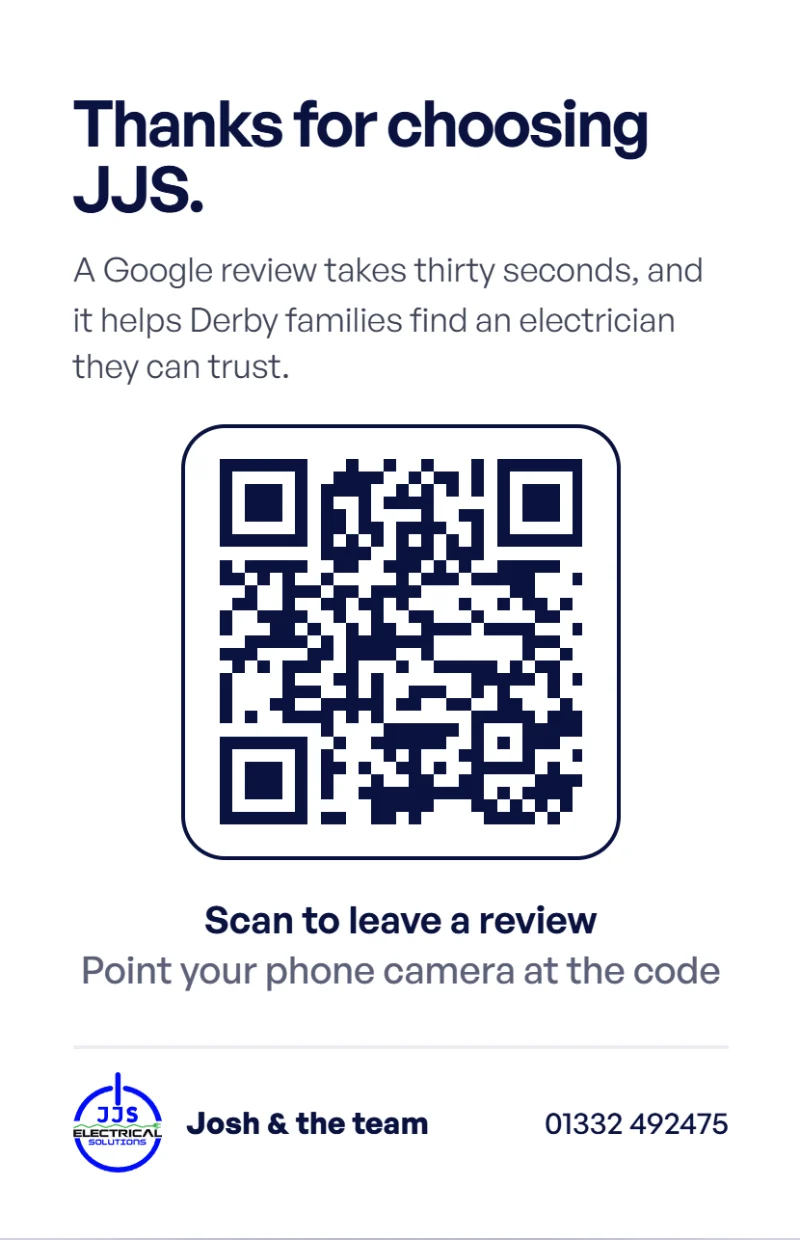
We designed JJS’s first print when they were starting out. There was no brand guide then, so each piece was made on its own, with its own blue, typeface and contact details. Building the website gave JJS a brand, and we have redesigned the whole set in it, ready for their next print run: the same navy, the same type, the green on one phrase only, the full-colour logo, and Flick.
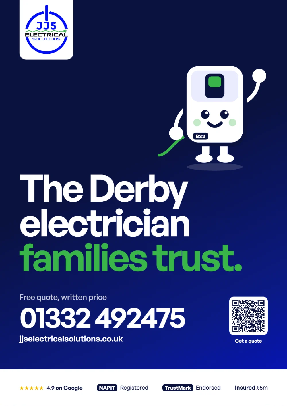
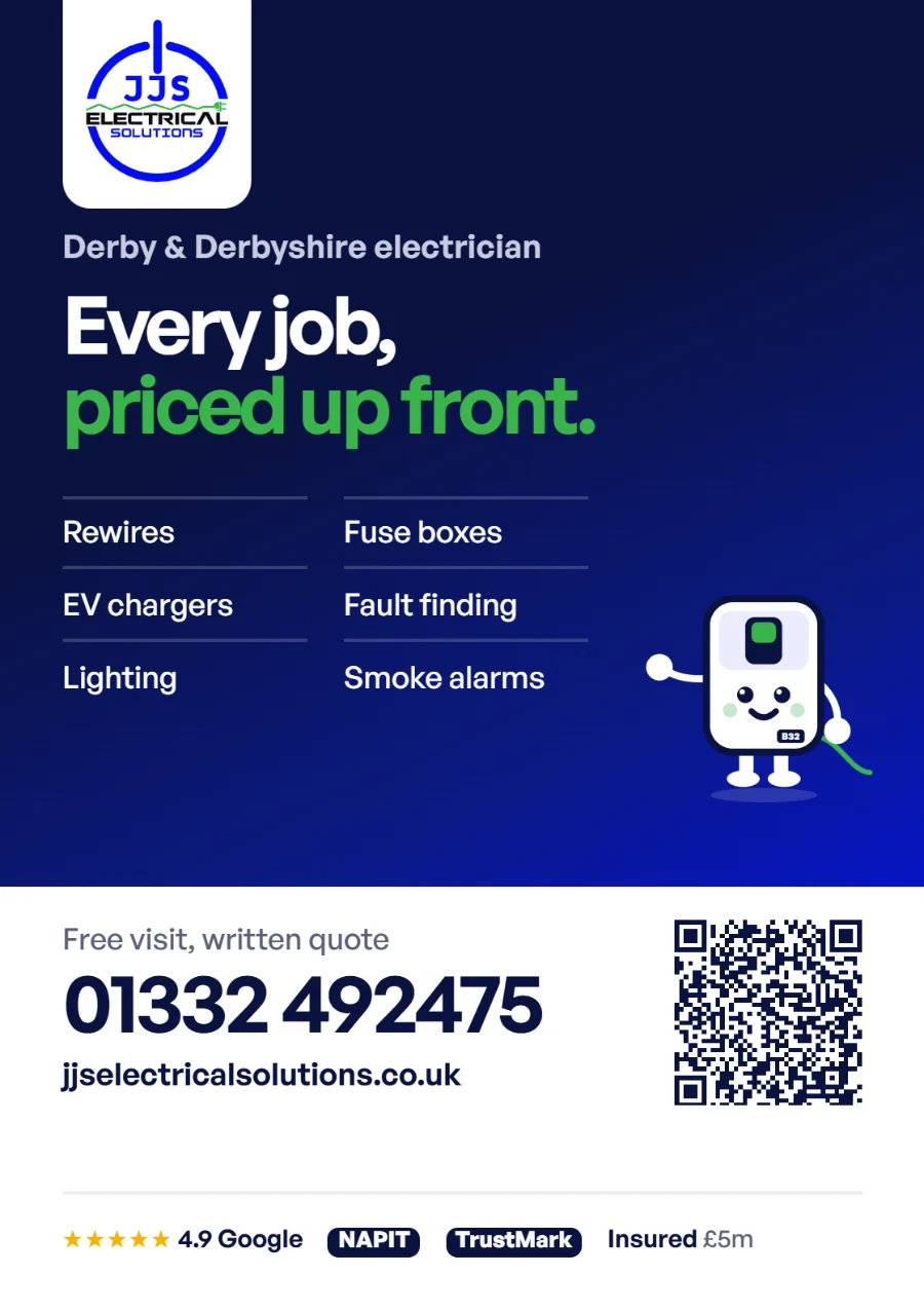
Where they started
Their first print, which we designed before there was a brand guide.

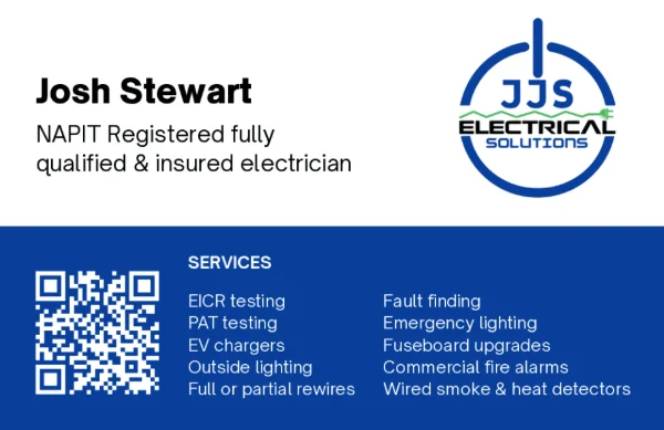
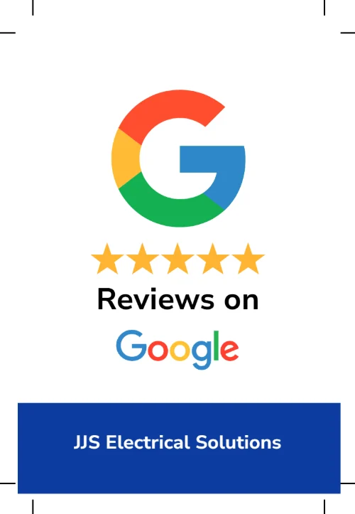

- One phone number and one email on every piece, the same ones as the website.
- Prices up front, the website's strongest idea, now on the card and the advert too.
- JJS first, Google second on the review card, with a QR code big enough to scan without thinking.
- A tracked QR code on each piece, so JJS will see which one brings people to the website.
How it fits together
Each piece is designed to hand on to the next
The board
Seen outside a job, it puts the name, the number and Flick first, big enough to remember.
The website
They look JJS up, see the rating and the prices, and ask for a quote with their postcode.
The business card
Left after a visit with a price written on it, and a code that scans straight back to the prices.
The review card
Handed over when the job is done, it asks for a Google review, so the rating on the website keeps growing.
Want your website and print to match?
One team for both, so your site, your cards and your signs look like one business.